I will be comparing three of my artworks. One is the “Stay Home Poster” made in 2021, the second is the “Semester Map Board Game” made in 2021 and the last artwork is “Make a Wish to the Bottle” token in 2020.
The similarities are that all three artworks use many colors and feel the positive emotion from the artwork. From my view, I think colorful artwork can show joy and playfulness. It will give the audience a positive feeling when they see the artwork. For the “Stay Home Poster” the objects are pastel colors. It uses the color shown like the house we are living in normally and the color of the house is much brighter than the normal house we live in. The grayish various stamps and the face of the house has a cute design and it is more like a cartoon character. The poster makes the meaning of the poster easy to understand from children to adults in a positive way and it announces that staying at home is the best solution to protect yourself (to escape COVID-19), because COVID-19 changed our way of life so many people are losing hope for the future. People did not imagine that the year 2020 to 2022 will become a hardest year for living. I think the view we are living in is colored by many things to make the audience positive mind. For “Semester Map Board Game”, this is also a colorful artwork. Each square has been colored with different colors in order with patterns. Using different colors makes it more childish but when we look at the map, it looks exciting by following the days and spending time at a university’s drawing class in one semester. The details in the square story about what happened in those days. The photo of “Make a wish to the bottle” was taken at the happiest place on earth with imagination. so, the photo looks full of joy by adding bright colors to make it dreamier. The theme park’s mascot is on the bottle cap, and the colorful stones shining in the sunlight. Each of the artwork uses bright colors.
The difference between these three artworks is the subjects and the materials. For “Stay Home Poster”, it is made by digital illustration and the subject is a House wearing a mask to announce stay home. The House’s face is sobbing. This shows how the time in 2020 (pandemic) was hard for us and the sobbing emoji was a trend in 2020. Compared with the other two, this artwork is trendier theme artwork. The drawing “Semester Map Board Game” is made of paper and colored with pencils. It does not have a main subject but there are many details drawn in each square. It is easy to know what the theme of the week was and what did the artist worked on during class time. The subject’s length on the square is how long the project took, and the square with a subject is the project’s starting point. This artwork is more psephitic theme that only few people can understand at the first point comparerd with others. “Make a wish to the bottle” is a digital photo with editing and the subject are the two bottles. The bottles are the main focus, so it is easy to understand the subject and it is clear compared to the other two artworks. In this artwork there is no other object in the photo except the earth fountain in the background.
In conclusion, all the three artworks are colorful and have a positive emotion but the subject and materials are different.
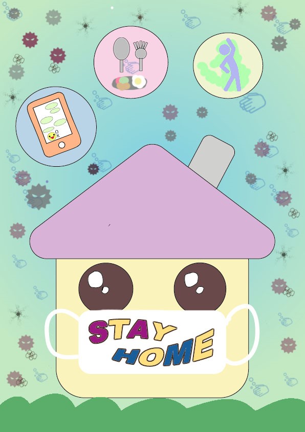
Stay Home Poster, 2021
Digital Illustration
532 x 625 px
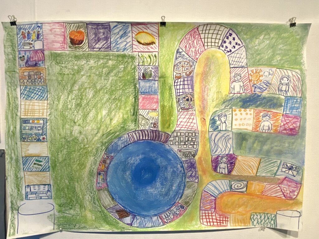
Semester Map Board Game, 2021
Color pencils, Paper
594 x 420 mm
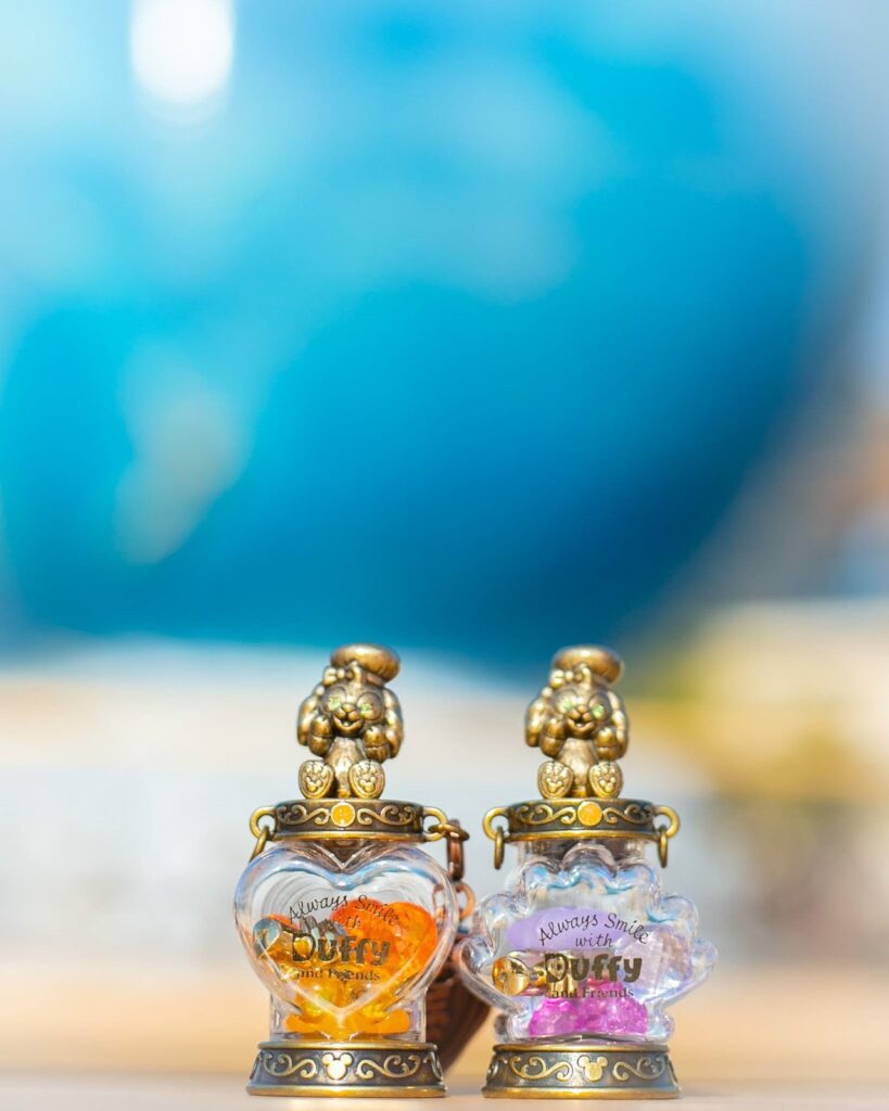
Make a wish to the bottle, 2020
Digital color photo
1638 x 2048 px
Bio
Luna Ishizaki is an artist who lives in Tokyo, Japan. She is mainly focused into photography, graphic design and motion graphics. Luna’s art style is unrealistic with high saturation colors and sparkles. Her work idea is the trend topics which is based on things happening around her.